What is it that makes a software interface scalable? Scalable can mean a lot of things, but when we talk about scalability in the context of the NetBeez user interface, we’re basically talking about the ability of the interface to adapt to a variable amount of input and data and not lose any of its intuitiveness. So with a scalable interface, you’d be able to manage hundreds of widgets and a flood of data just as easily as you’d manage a handful of widgets and a trickle of data.
There’s a lot of stuff that goes into the construction of a strong user interface, and it goes deeper than that look and feel or placement of buttons and widgets. Here’s a breakdown of a few of the big ticket items.
Scalability
Scalability is a major centerpiece in the NetBeez interface. The NetBeez dashboard, in particular, needs to be able to properly handle and display widely varying amounts of data and provide the same experience for both large and small installations. This can be tricky because a certain interface design may work fantastically for small installations but fall apart as soon as you add more than a couple dozen agents. On the contrary, a design with only large installations might lack the specificity needed to make a setup with only a dozen or so agents feel useful. With the NetBeez dashboard, we’re working on a layered approach, offering a number of views so that the user can iterate through increasingly granular levels of detail.
Workflow
This is another big one, and a very important one. In a lot of ways, it goes hand in hand with the scalability aspect of the interface design. How do you move from one task to the next? Is it a fluid, intuitive experience? Is access to various tasks organized in a sensible way? Optimizing an interface for good workflow is very important, and can save the user tons of time.
Dealing with Data
This is a broad area. I would say it encompasses data hierarchy, data visualization, and data aggregation. NetBeez is all about data, so displaying and parsing it in a way that scales and maintains a good workflow, especially in troubleshooting tasks, is of utmost importance.
And back to the NetBeez dashboard:
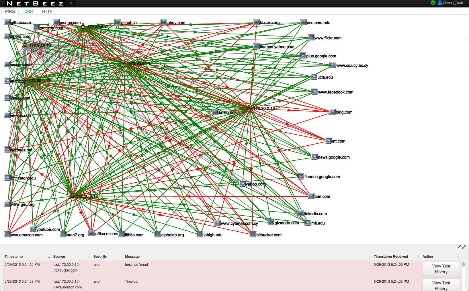
Attaining scalability has definitely been a strong driver in developing ever better interactions and workflow for the NetBeez dashboard. The dashboard interface has certainly come a long way since the very early days. Back then, the interface was… not very scalable. Screens became huge and unwieldy with more than a dozen agents and a couple dozen tests. It was difficult and tedious to navigate and data was heavily siloed.

We’ve come a long way since those early versions – the current iteration of the NetBeez dashboard is much, much better at handling large installations. We’ll be implementing some awesome new features for the next major release, like a Real Time Alerts tab that gives you a much more comprehensive overview of the overall network performance and, at long last, provides some aggregated performance data, an aspect of the interface and workflow that has been sorely missing up until this point.
Not only that, we are also working on a major overhaul for the agent and target detail views. There’s been a lot evolution in how these detail views have been presented – what started as a quick way to view more in-depth details about an agent (and later target) has become a comprehensive panel in its own right – with all sorts of access to historical data and graphs, a deeper cross-sectioning of test data associated with the agent or target, and more. The current implementation doesn’t cut it anymore – the way the details view is used now doesn’t match its original use that inspired the current agent/target view paradigm.
Currently, even when details are opened, the grid of agents or target thumbs still dominates. The details panel jumps in like an afterthought and clings to the side. It worked for a quick view of a bit of extra info, but now that the information and visualizations contained in the details panel has evolved and expanded so much, it needs to take precedence. And that’s just one example of how a feature designed with a particular use case in mind has completely outgrown its framework and needs some serious rethinking.
However, it’s all the evolution and the process of learning how people actually use the features we implement that informs how we build it, how we improve it, and how we optimize it for scalability.