There’s plenty of debate over the role of skeuomorphism in digital interface design. Do buttons still need to be “button-like” now that basically everyone knows how to click/tap on rectangles that resemble buttons? Is the flat design aesthetic of iOS 7 the way of the future? Is skeuomorphism dead? In my opinion and experience, well-placed (and usually subtle) skeuomorphic elements, the aesthetic attributes added to something to make it resemble a more familiar object or procedure (like giving a digital button the appearance of a physical button), absolutely have their place in a successful interface design, but it’s one of those things that must be handled delicately because it’s so easy to go overboard or simply get it wrong.
Radial gauges, the worst and most baffling interface element I’ve encountered in my UI research, get it all wrong, yet they are everywhere. They are used to measure just about every digitally calculated metric under the sun, from response time to bandwidth to CPU utilization.
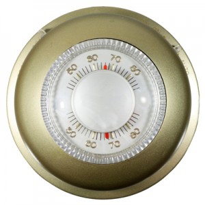
First, let’s talk about radial gauges in their original, proper context. This sort of gauge is everywhere in the physical world. You can find them in your car, on produce scales in the grocery store, on your boiler, on your (old school) thermostat, using analog means to measure physical properties like speed, weight, pressure, and temperature. Whatever you are measuring manipulates a carefully calibrated mechanism that then moves a needle. The needle points to the corresponding measurement. It’s a radial form because it’s an elegant mechanical solution. Basically, radial gauges are awesome for displaying measurements of physical properties taken by physical, analog means.
A radial gauge is an inexorably mechanical and physical means of displaying a measurement. How their use became so ubiquitous in IT software dashboards is a question for the ages. It’s not like there’s a precedent for displaying metrics like server response time, bandwidth, or packet loss on analog gauges, seeing as how there’s no analog equivalent of displaying measurements of network performance and never was. I can only imagine that digital gauges came about as a means to style newfangled digital dashboards to superficially resemble analog dashboards full of analog means of displaying information and measurements. I doubt there was any sort of deliberate intent to utilize skeuomorphism in many of these dashboard designs – radial gauges look cool in your car and your car has a dashboard, so they’ll probably look cool in this digital dashboard too, and everyone gets it’s a dashboard because it has gauges!
Sure, the use of radial gauges might be sorely misplaced and implemented without regard to what makes contextual sense for the type of data you’re displaying, but what makes them bad design? Firstly, they’re a giant waste of space. All the information I’ve seen displayed in IT radial gauges can be just as effectively displayed as regular old text, which uses a fraction of the screen real estate. Also, doing stuff like placing similar-looking gauges that measure vastly different metrics and have different ranges and units makes it quite difficult to interpret all that data at a glance. The needle at 9 o’ clock one gauge (say, CPU utilization) might indicate a normal, acceptable status, while the needle at 9 o’ clock on the next gauge over (say, bandwidth), indicates a critical status. Secondly, some of the metrics I’ve seen displayed on gauges do not have a finite, consistent range of possible values. A particular gauge I’ve seen, which measures response time, displays a range of 0 to 2500 milliseconds. The vast majority of the gauge’s color-coded range is red, while the tiny bits of green and yellow next to 0 indicate the normal and borderline range of expected values. The needle has about two degrees of movement before it hits red. It’s hard to tell if the needle has moved a degree or two. The whole gauge visualization becomes moot and useless (like it wasn’t already) because the scale is so skewed that the position of the needle becomes meaningless. Besides, since radial gauges only display data, they offer no functional design affordances, which kind of defeats the whole purpose of responsible skeuomorphism. They are just bad design all around.

If gauges aren’t the answer, then what is? Well, there are plenty of other, better ways to display the data. Even text is better. Like this: Response Time: 20ms. And this: Response Time: 265ms. There. My colored inline text examples are more effective at displaying relevant information about response time than a radial gauge. And they take up way less space. Sometimes, though, some form of visualization is necessary to effectively and quickly relay large amounts of data or complex data. Just because you can shove data into any old graph or chart doesn’t mean that the choice is arbitrary – some visualizations are better for some types of data than others.
Dissecting, organizing, and visualizing data is a surprisingly large part of the design work that happens at NetBeez. The NetBeez software collects, parses, and displays loads of data. We’re always looking to improve how we do data visualization. It’s an ongoing, iterative process, and we never know when we’ll come up with a better method or some cool comparative analysis visualization or something. But one thing is certain: radial gauges belong on boilers and in cars, not in IT software interfaces.
Have you used software that displays data with radial gauges? What do you think of them? Any particular type of visualizations you’d rather see? I’d love to hear your comments.